Client
Notitia
Services
UI & UX Design
Website Design
Industries
IT
Date
July 2024
Notitia
Notitia
Website Re-design
Website Re-design
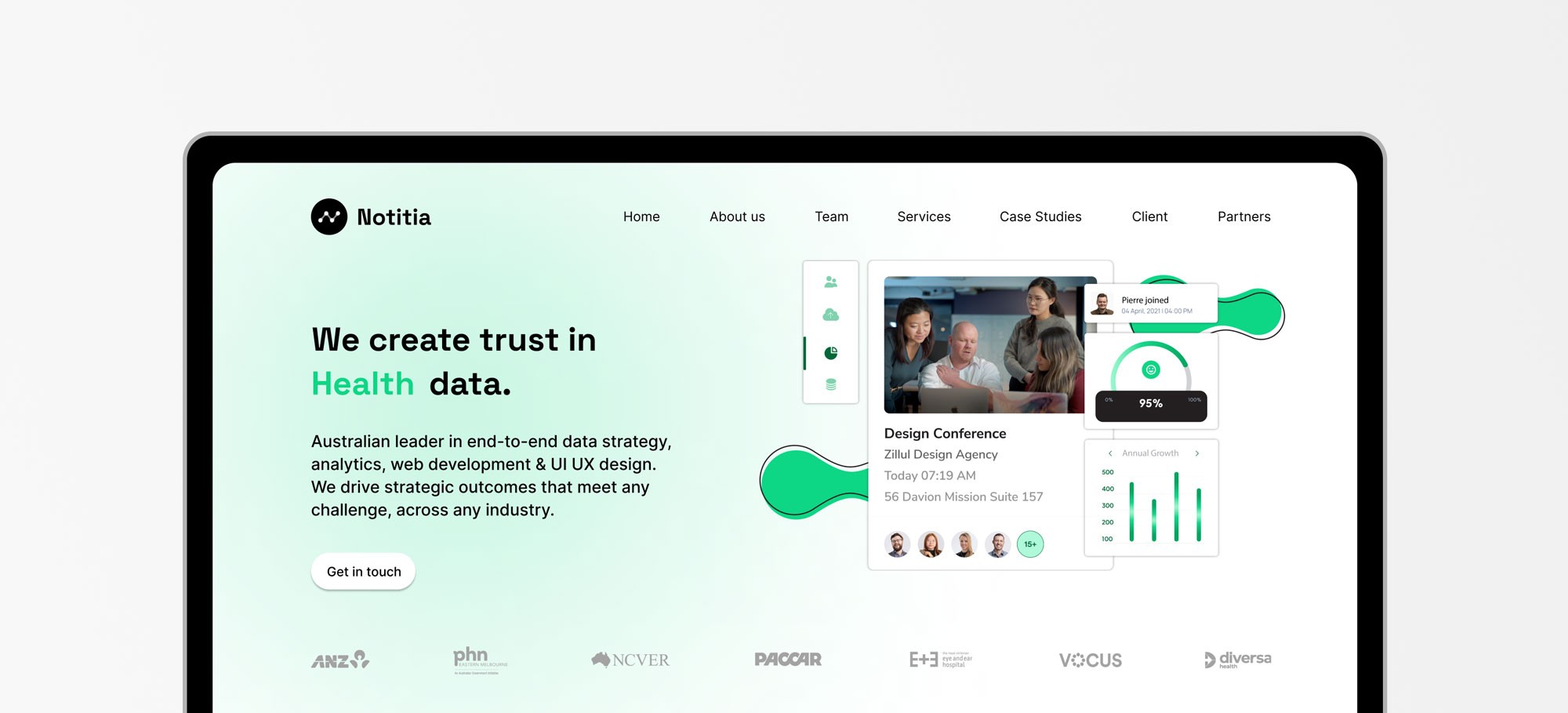
The Notitia website redesign aimed to align the digital experience with the company’s growth and evolving brand identity. Through user research and stakeholder interviews, the team identified usability issues and content clarity gaps. These insights informed a restructured site architecture and refreshed visual language, resulting in a clean, user-centered platform that enhances navigation, accessibility, and long-term business impact.
The Notitia website redesign aimed to align the digital experience with the company’s growth and evolving brand identity. Through user research and stakeholder interviews, the team identified usability issues and content clarity gaps. These insights informed a restructured site architecture and refreshed visual language, resulting in a clean, user-centered platform that enhances navigation, accessibility, and long-term business impact.
Background
Why we updated our website?
Not every website needs a redesign. The first step is to conduct research to understand how your website aligns with user experience and expectations. A clear analysis can reveal whether minor adjustments or a full overhaul is necessary.
In our case, it was evident that we needed a redesign that reflected how much we’d grown. While our site was functional, Notitia had evolved significantly over just a few years, and our website no longer represented who we are and what we do.
In our research we had identified key pain points in the user experience. We wanted to address these challenges to create a seamless and friendly experience, ensuring our website effectively communicated our services and values.
Design Process

1. Empathise & Define
1. Empathise & Define
We gather insights to understand user needs and challenges, then clearly define the problem to solve, ensuring we address the right issues.
We gather insights to understand user needs and challenges, then clearly define the problem to solve, ensuring we address the right issues.

2. Ideate
2. Ideate
We brainstorm solutions, explore possibilities, and generate ideas to address the defined problem, focusing on user needs and innovation.
We brainstorm solutions, explore possibilities, and generate ideas to address the defined problem, focusing on user needs and innovation.

3. Prototype
3. Prototype
Turning ideas into tangible models. We create drafts or mockups to test concepts, refine solutions, and gather feedback before final implementation.
Turning ideas into tangible models. We create drafts or mockups to test concepts, refine solutions, and gather feedback before final implementation.
Step 01.
Empathise & Define
Step 01.
Empathise& Define
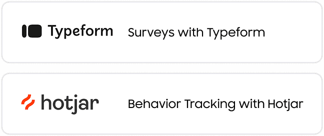
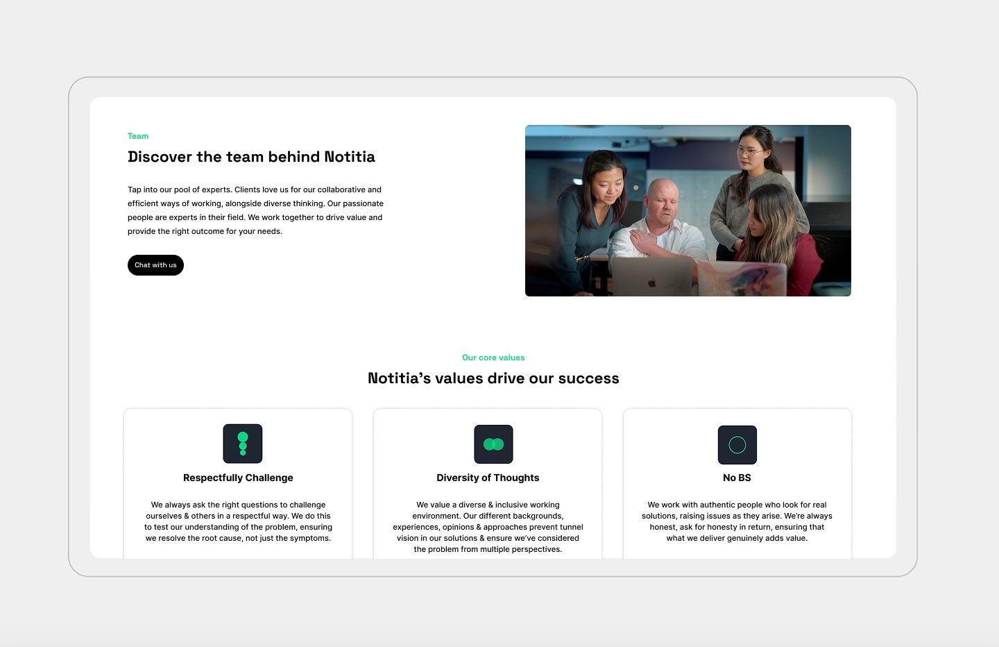
To better understand our users, we focused on empathising with their frustrations and identifying their needs. Using tools like Typeform and Hotjar, we listened directly to their perspectives and observed how they interacted with our site.
To better understand our users, we focused on empathising with their frustrations and identifying their needs. Using tools like Typeform and Hotjar, we listened directly to their perspectives and observed how they interacted with our site.
key Findings from the Research
key Findings from the Research
1. Lack of clarity for new users
Visitors unfamiliar with consultancy agencies often found it difficult to understand our services and their potential benefits.
2. Ineffective homepage as a navigation hub
Our homepage wasn’t effectively guiding users to explore other sections of the site, limiting engagement with additional content.
3. Web architecture and user flow issues
Navigation challenges, such as U-turns and dead ends, disrupted the user journey, preventing meaningful engagement.
4. Content visibility problems
Although we had compelling content, layout issues often made it easy for users to overlook key information. Below, you can see the initial report for the homepage as an example of our findings.
Results from the Homepage report
Results from the Homepage report
We want to share a bit of our process and insights with you, so here’s a sneak peek at the report we created for the homepage, which we shared internally as part of our analysis and workflow.
Connect to Content
Add layers or components to swipe between.
Step 02.
Ideation
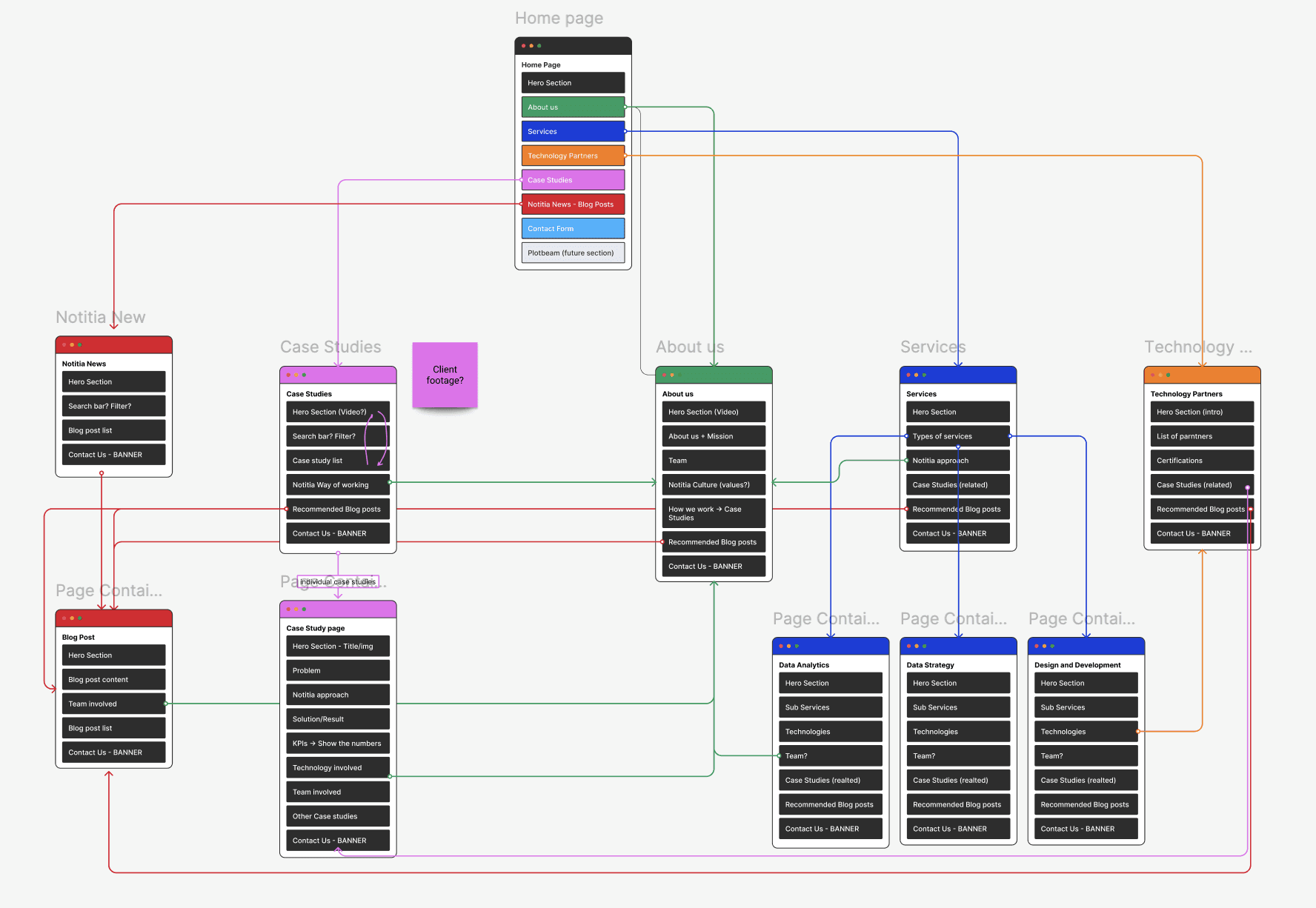
After identifying the key issues, we moved into the ideation phase. Our goal was to reimagine the user flow and site architecture to ensure users could navigate smoothly while easily accessing all the information about our services.
To reduce bounce rates, we also made sure the entire website felt interconnected. By ensuring all pages were thoughtfully linked and part of a cohesive structure, we aimed to keep users engaged and guide them naturally through the site without any dead ends or friction points. This phase involved mapping out a clearer structure for the site, prioritising intuitive navigation, and ensuring our services were presented in a way that was both engaging and easy to understand.
Step 03.
Prototyting
Step 03.
Prototyting
Our goal was to simplify the design, reduce unnecessary animations, and use them with purpose. Previously, some animations existed solely to create a "cool" vibe, but we decided to make them more intentional—serving to highlight content.
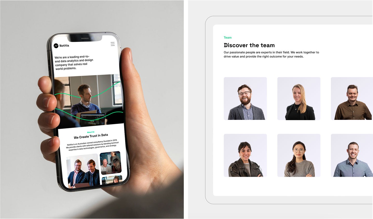
We also moved away from abstract and 3D icons, which, while visually appealing, negatively impacted loading times and didn’t help users connect with the information. Instead, we chose a more literal approach: if we’re discussing data analytics, the accompanying imagery should clearly represent the concept.
We began the prototyping process by creating drafts for the website pages. This phase coincided with a rebranding effort, as we wanted to give the site a fresh, clean look.
Our goal was to simplify the design, reduce unnecessary animations, and use them with purpose. Previously, some animations existed solely to create a "cool" vibe, but we decided to make them more intentional—serving to highlight content.
We also moved away from abstract and 3D icons, which, while visually appealing, negatively impacted loading times and didn’t help users connect with the information. Instead, we chose a more literal approach: if we’re discussing data analytics, the accompanying imagery should clearly represent the concept.
We began the prototyping process by creating drafts for the website pages. This phase coincided with a rebranding effort, as we wanted to give the site a fresh, clean look.
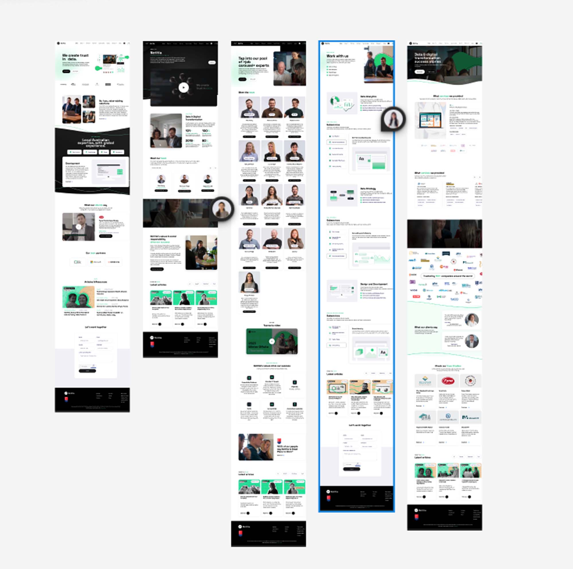
Additionally, we worked to create a cohesive design system—one that would be easy to interpret, consistent across the site, and free from unexpected surprises. By maintaining this consistency, we ensured users could navigate intuitively and focus on the content.
Lastly, we aimed to streamline the colour palette, reducing the number of colours for a more cohesive and professional appearance. This was a parallel process: as we built and tested page layouts, we experimented with different approaches to refine our new visual identity.

You may also like

Fast Pay
Fast Pay
Payment UX →
Payment UX →

Notitia Corporate
Notitia Corporate
Corporate Branding →
Corporate Branding →

Australia Government
Australia Government
Dashboard UIUX →
Dashboard UIUX →